
Typography is a technique used to arrange type in a way that makes it visually appealing. So let’s get into it shall we?A typeface is a large selection of letters, each unique yet each containing the same variations of shape. Typefaces are chosen based on style and readability. I know what you’re going to say, “but typefaces isn’t the same as typography” and you’re absolutely right.
Typography is the use of type and typeface is the creation/making of type. Typography dates way back, like around the 11th century. Before what we call the “digital age” came into place typography was specially used for books, bible’s, magazines, and then finally public work. Nowadays, typography is a part of our digital word and our printing world. The internet allowed for typefaces to grow and supply itself in huge amounts. Type was never more diverse!
How are fonts used?
Fonts are used according to its specified purpose. Not only that, as a designer one has to think about the different pairs of fonts that would look good with their main font. A good rule of thumb to follow is opposites! If you have a thick font then compliment it with a thin one, if you have a serif complement it with a sans font, etc.
Old Style, Modern, Transitional. These categories guide you to the font you need in order to complete your design. If you’re going for an elegant design than perhaps you should lean more towards transitional fonts. Transitional fonts provide the best of both worlds, the readability of Modern with the Classic lines/curves found in Old Style.
Good Examples
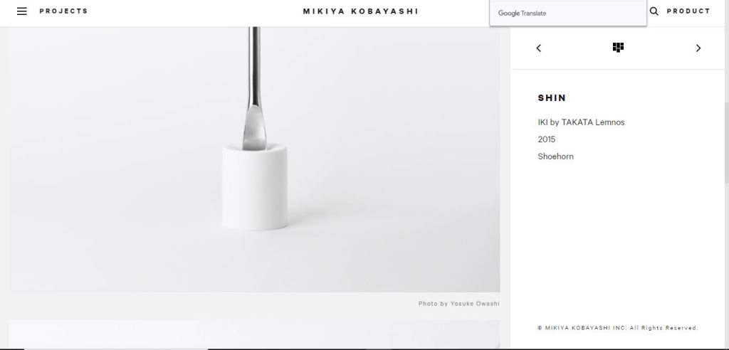
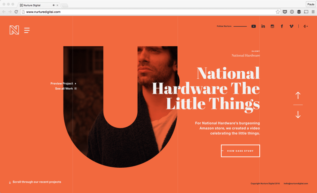
If we take a look at the designs above we can already tell that they’re easy on they eyes. The design is neat and aligned, and the contrast between thick and thin fonts is sublime. These websites make me happy.
Bad Examples


Now these websites give me anxiety. There is nothing about this website that I like. Disgusting. If you ever make a website like this, retire immediately you’re a menace to the design community.
Lets, see what happens to be wrong with these, type wise. In the website above the fonts do not compliment each other at all, its thin with thin. And in the website below, the body paragraphs are too small to read. And the color of yellow against the blue background hurts the eyes.
