
The Joshua Tree Epiphany is a rule of thumb that helps guide people to create good designs. It has four principals: Contrast, Repetition, Alignment, and Proximity. Contrast is the same as the word opposite. Light/Dark, High/Low, Heavy/Light. The point is to stop your elements from being too similar, make them stand out.
Repetition is when you repeat your visual elements throughout your design. An example could be a certain font family, color, shape, texture that you see over and over again in a design. Repetition allows a pattern to form and makes your work distinguishable from other people’s work (logo). Alignment is when you place things in a way that they line up together and create an invisible line. This line organizes your work and allows your audience to make visual connections throughout. It can guide them throughout your work and show them which set of information they should read next.
Proximity is when you group bits of information that relate with each other.An example of this would be a magazine or movie selection, If you pick up a magazine you will see groups of information in chunks. This allows for all the relevant info to be gathered together in one space and provides a good amount of white space so you can rest your eyes. And in movie’s, the different types are separated into different genres where they all share one thing in common: horror, comedy, romance, thriller, and sci-fi.
If we take a look at the following websites, you will be able to see traces of the 4 principles of design in each and every one of them.

If we take a look at this website right here we can already see two cases of contrast; the uses of different font, and the striking red on blue background. The red and font seems to be repeated throughout the homepage design, so that’s repetition. And as for alignment, the information seems to be aligned to the left of the screen allowing for a straight invisible box going all the way down. If you follow this line you can see the principle of proximity being put to use, the title and the relevant information are set near each other in order to make it easier to find the relevant information.
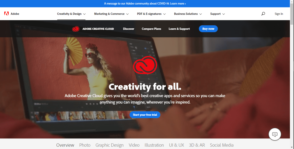
The next web page we will be looking at is one run by Adobe. The contrast is seen in the action buttons, they both share a striking blue color. And if you take a look at the logo, its also quite contrasting against the background picture, but not only that, it’s also repeated. It is repeated twice, underneath the top tool bar and on the center of the page. Finding the alignment might be less obvious than the first one we took a look at, this is because it has a center alignment. The tool bar is of course always straight across, but the information in the center moves like an upside down pyramid. Looking at the information in the center, the title and the short summary are close together right? That’s because the information relate with one another.
And those are two real life examples of searching for the four principles of design in web pages. See you next time!
